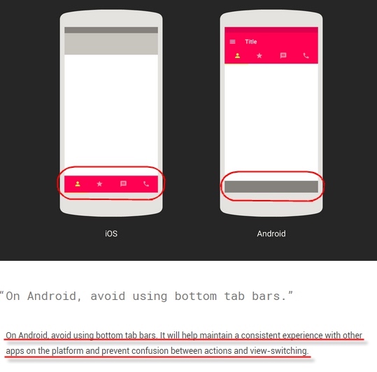
One day in March, Google updated its design guidelines with a new component: Bottom Navigation. This release was quite surprising to many, as Bottom Navigation hadn’t been mentioned in previous Material Design iterations. Traditionally, one of the biggest differences between Android and iOS design was the use of bottom bars; while they were essential for iOS, Android apps following MD guidelines generally avoided them.
This is the first article in a series on Android Bottom Navigation, covering its usage and historical evolution.
1. Previous Android Bottom Bar Design Specs
2. WeChat’s Redesign
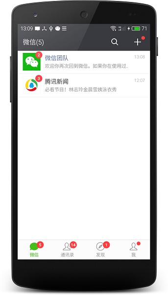
Before Google’s official support, WeChat caused quite a stir in the Android community when it moved away from the bottom bar in version 5.2, only to quickly bring it back after testing.

3. Google+’s Redesign
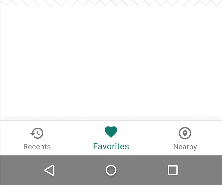
The most recent major app to adopt Bottom Navigation before it became official was Google+:

While it felt like a reversal of previous design philosophies, rules are made to be refined. WeChat, for instance, proved that user experience often trumps rigid adherence to a single design language.
4. Bottom Navigation Design Specs
Let’s look at the official Bottom Navigation Design Guidelines. For developers, following these specs ensures that our apps look professional even without a dedicated designer.
4.1. Usage
Bottom Navigation is primarily designed for mobile apps, providing quick navigation between top-level views. Larger displays, such as tablets or desktops, should use side navigation instead.

4.1.1. When to Use
Use Bottom Navigation when:
- There are three to five top-level destinations of equal importance.
- These destinations need to be accessible from anywhere in the app.
[Do and Don’t] 1. Number of Items
Don’t use Bottom Navigation for fewer than three destinations; use tabs instead.

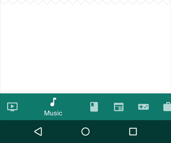
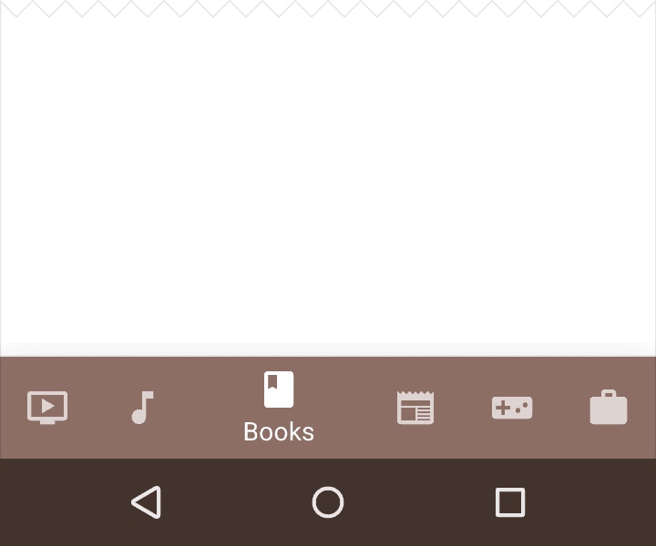
[Do and Don’t] 2. No Horizontal Scrolling
If you have more than five items, move the extra ones to a navigation drawer. Never make the bottom bar scrollable.
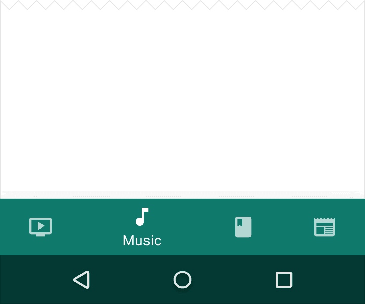
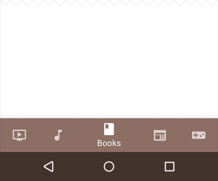
[Do and Don’t] 3. Optimal Item Count
Keep the count between 3 and 5. More than five makes the targets too small and crowded.
5. Bottom Navigation vs. Tabs
Mixing Bottom Navigation and tabs can be confusing for users. For example, clicking a tab that changes the entire bottom navigation state (or vice-versa) leads to a poor experience.
Tabs rely more on swiping gestures, whereas Bottom Navigation is designed for convenient tapping due to its proximity to the user’s thumb.
About Me && Blog
Below is my personal intro and related links. I look forward to exchanging ideas with fellow professionals. “When three walk together, one can always be my teacher!”
- Blogger Intro
- Blog Content Navigation: A guide for my blog content.
- Curated Excellent Blog Articles - Android Performance Optimization Must-Knows
- Android Performance Optimization Knowledge Planet
One walks faster alone, but a group walks further together.