One day in March, Google updated its design guidelines with a new component: Bottom Navigation. This release was quite surprising to many, as Bottom Navigation hadn’t been mentioned in previous Material Design iterations. Traditionally, one of the biggest differences between Android and iOS design was the use of bottom bars; while they were essential for iOS, Android apps following MD guidelines generally avoided them.
This is the second article in a series on Android Bottom Navigation, covering style, behavior, and dimensions.
1. Style
1.1. Icons and Text
Because bottom navigation actions are presented as icons, they should be used for content that can be suitably communicated with icons. Use icons that follow these styling rules:
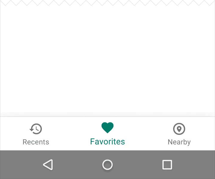
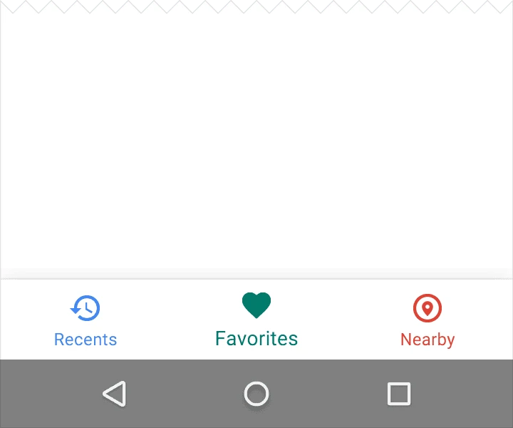
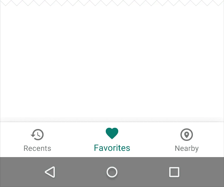
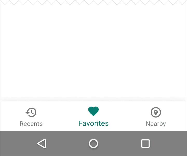
- Show the icon and text label for the focused (active) item.
- If there are only three items, show icons and text labels for all items.
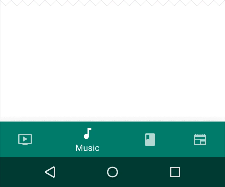
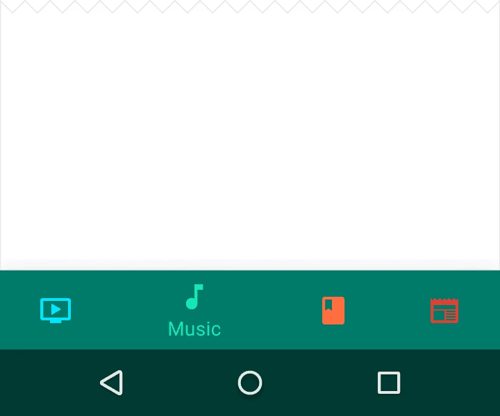
- If there are four or five items, show only the icon for inactive items.
1.2. Color
Tint the current bottom navigation action (including the icon and any text label present) with the app’s primary color.
If the bottom navigation bar is colored, use black or white for the icons and text labels.
1.3. Text Labels
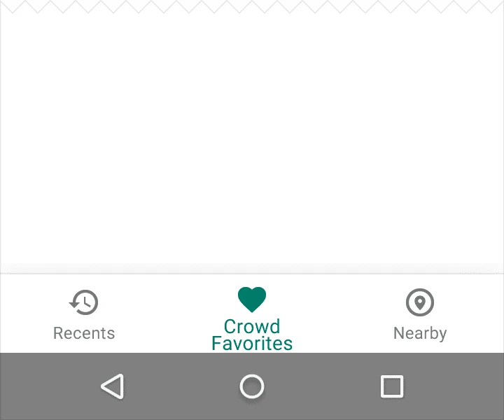
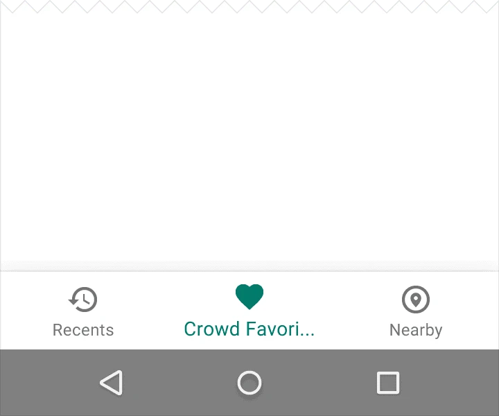
Text labels provide concise definitions for navigation icons. Avoid long text that may be truncated or obscured.

2. Behavior
Tapping a bottom navigation icon will navigate directly to that view or refresh the current view.
- Each icon must point to a target and should not open a menu or a separate window.
- The navigation bar can be shown or hidden dynamically during scrolling:
- Hide the bar when scrolling down.
- Show the bar when scrolling up.
- Swipe gestures on the content area should not trigger navigation.
- Use cross-fading animations when transitioning between views.
3. Dimensions
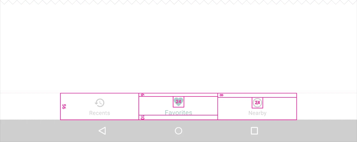
3.1. Fixed Bottom Navigation Bar
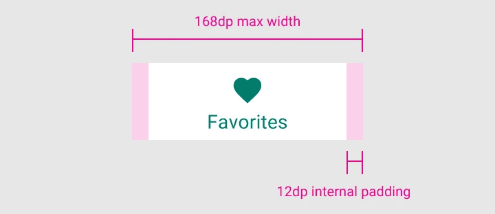
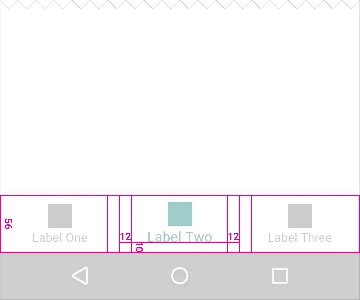
Divide the total length of the bar by the number of icons to calculate the width of each item. Ensure each item has sufficient space.
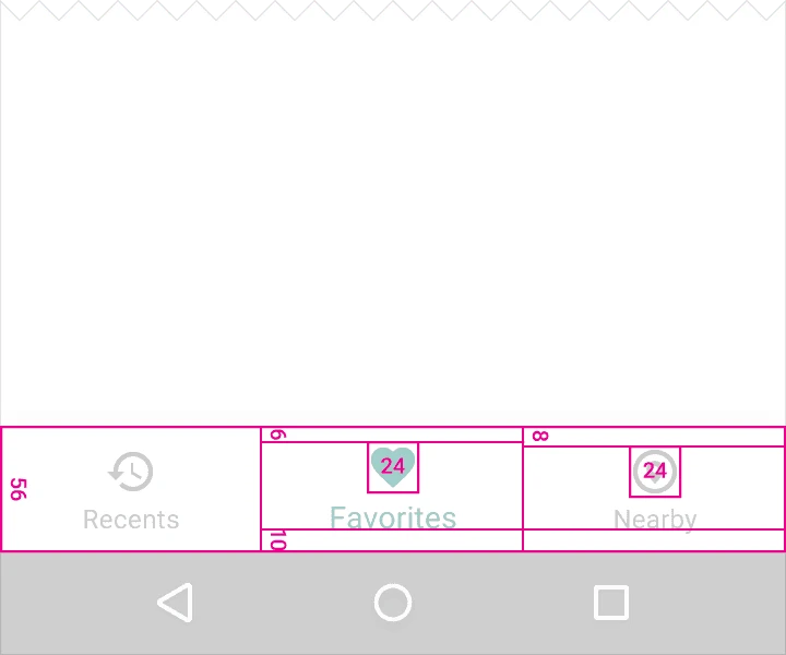
Width constraints (including padding):
- Maximum: 168dp
- Minimum: 120dp for large screens, 104dp for small screens
Height: 56dp
Icon size: 24x24dp
Alignment: Items should be centered both horizontally and vertically.
Padding:
- 6dp above icon (active view), 8dp above icon (inactive view)
- 10dp below text label
- 12dp left and right of text label
Text Labels:
- Roboto Regular: 14sp (active view)
- Roboto Regular: 12sp (inactive view)
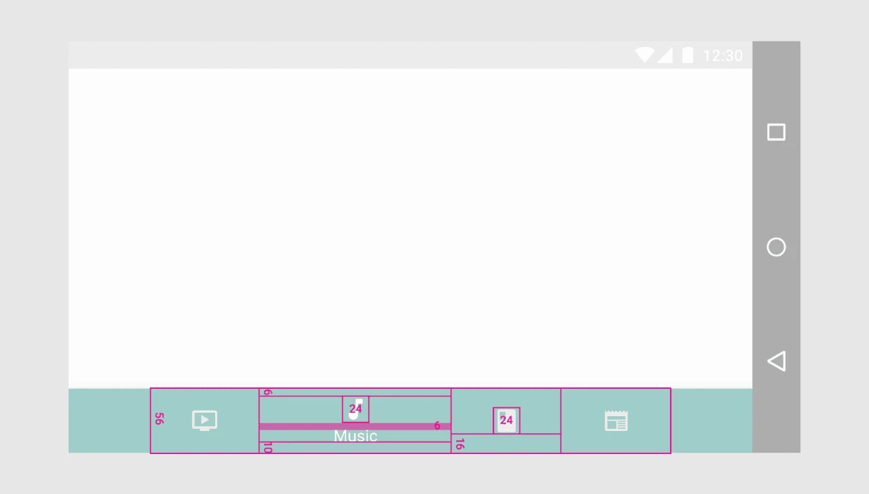
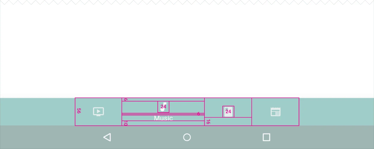
3.2. Shifting Bottom Navigation Bar
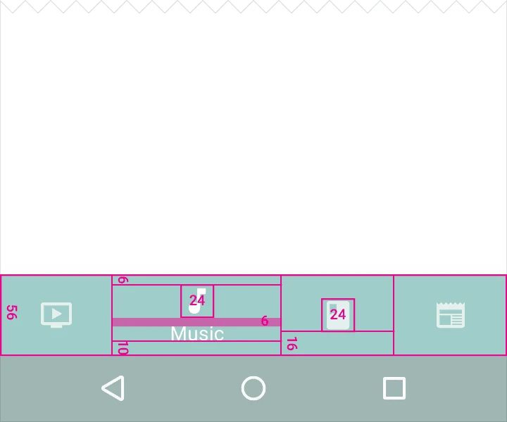
Width constraints (including padding):
Active Item:
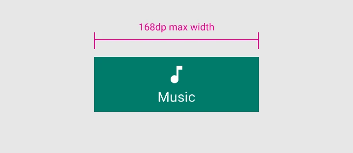
- Maximum: 168dp
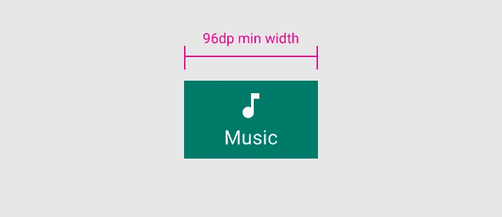
- Minimum: 96dp
Inactive Item:
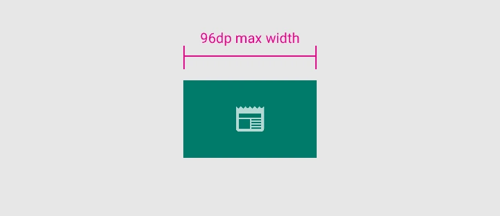
- Maximum: 96dp
- Minimum: 64dp

Height: 56dp
Icon size: 24x24dp
Alignment: Centered horizontally and vertically.
Padding:
- 6dp above icon (active view), 16dp above and below icon (inactive view)
- 10dp below text label
Text Labels:
- Roboto Regular: 14sp (active view)
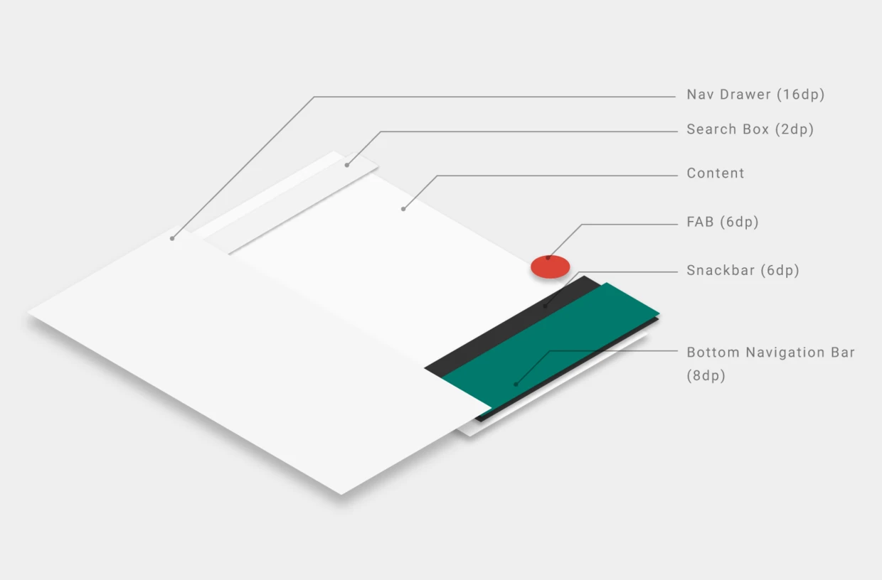
4. Elevation and Hierarchy
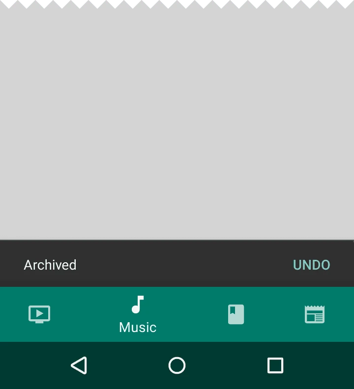
Since snackbars have an elevation of 6dp and the navigation bar has 8dp, snackbars appear behind the navigation bar. Bottom sheets, navigation drawers, and keyboards have higher elevations and will cover the navigation bar completely.
About Me && Blog
Below is my personal intro and related links. I look forward to exchanging ideas with fellow professionals. “When three walk together, one can always be my teacher!”
- Blogger Intro
- Blog Content Navigation: A guide for my blog content.
- Curated Excellent Blog Articles - Android Performance Optimization Must-Knows
- Android Performance Optimization Knowledge Planet
One walks faster alone, but a group walks further together.